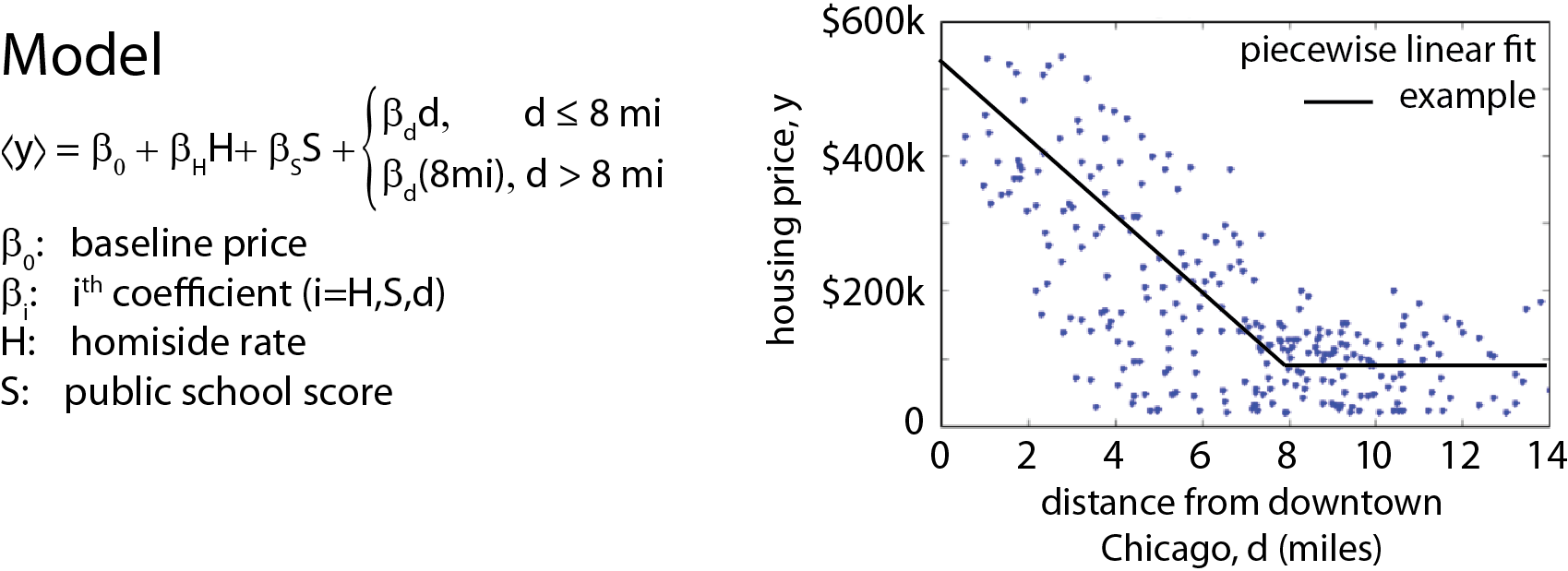
Dwelling In Crime

An interactive Chicago crime and housing price plotting tool that places a dollar figure on the value of improving crime locally.

 
Instructions:
  1. Choose a map layer
    (buttons below)
  2. Explore the map
  3. For more information,
    click on grid squares

Crime Rate Layers
     « All Crime Rate
     « Homicide Rate
     « Burglary Rate
     « Narcotics Crime Rate

School Rating Layers
     « Public School Ratings

Housing Price Layers
     « Price Data
     « Price Predictions

Auxiliary Layers
     « Transit Layer
     « Community Regions

Grid Size: .63 by .67 miles (width by height)
Parameter(s) Data Source
All reported crimes in Chicago, 2001-present
(>5.5 million reported crimes by type including homicides, burglaries, narcotics crimes, etc.)
City of Chicago Data Portal
Chicago condo/Apt./townhouse sales over the last 9 months
(>7500 geotagged sale prices)
Publicly scraped from Trulia
Chicago public school report cards (2011-12)
(566 geotagged schools, values range from 20 for the worst schools, to 80 for the very best schools)
City of Chicago Data Portal
Local talk, bike, and transit ratings Merged from walkscore.com/IL/Chicago and wikipedia data.
Community populations (and population density) Extrapolated from current walkscore.com estimates and cencus data
Distance from central business district Internal calculation

Analysis Summary

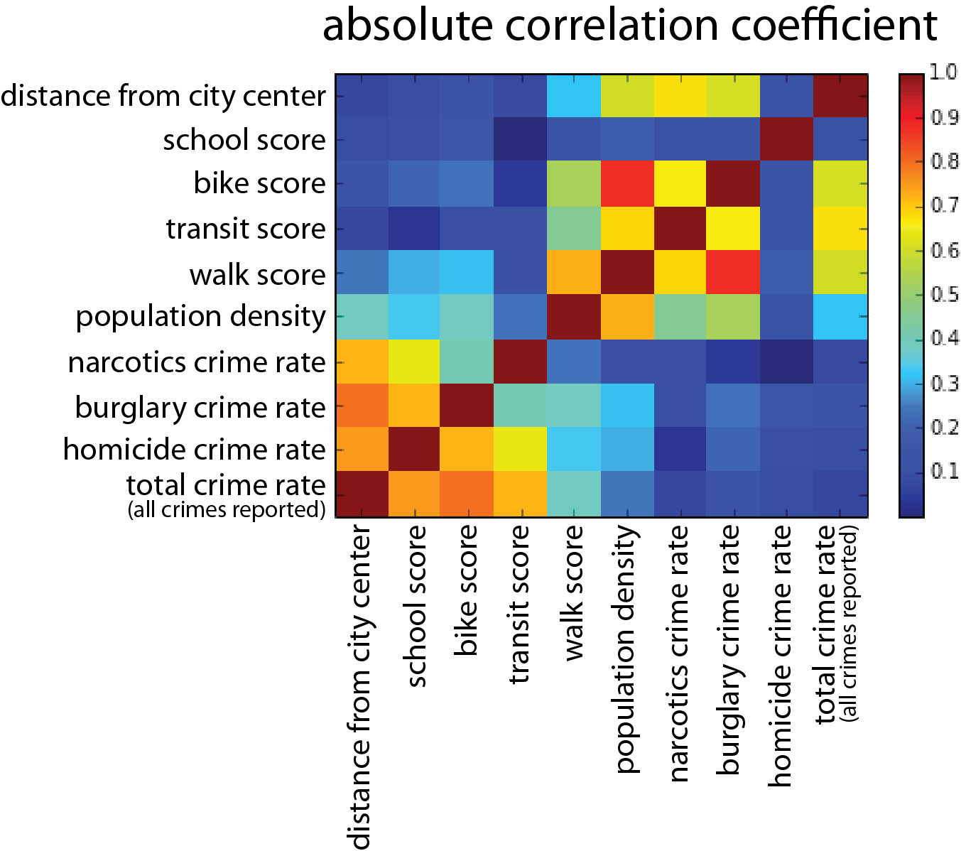
  • Three features were used to predict housing price (selection methodology below).
    • Homicide Rate
    • Public School Report Card
    • Distance From Chicago Center
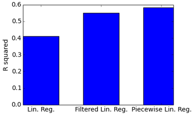
  • Linear and Lasso Regression on the entire dataset and a filtered dataset were initially used to train a housing price engine, although a Piecewise Linear Regression Model (figure right) was ultimated used instead
    • Each data point cooresponds to one grid point
    • Goodness of fits for models with a quadradic loss function are shown below
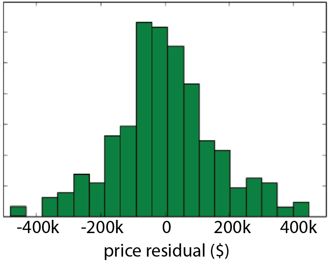
  • Bootstrapping was used to calculate coefficients and their standard deviations
  • To calculate the value added of improving crime locally (shown by clicking on grids in the data map), housing prices in each grid were compared to the predicted price in the grid if homicide rate were at the city-wide average


Below is a scatter plot showing apartment/condo prices
plotted against distance from the city center

scatter plots


Principal Component Analysis

Correlation Matrix
The absolute correlation matrix (figure left) determines which regressors are correlated amongst themselves. Using the rule that regressor correlation should be "blue" (roughly speaking), it is reasonable to use the following rules for choosing variables to regress over
  • one of {total crime rate, homicide rate, burglary rate, narcotics crime rate}
  • one of {population density, walk score, transit score, bike score, distance from down town}
  • school score
Choices (shown below) were chosen based on these rules and a Principal Component Analysis*


(* Eigenvectors of the correlation matrix ranked by Eigenvector and reprojected back into the original parameter basis)


Goodness of Fit

R Squared

Comparison Of Models:
 

  • Lin. Reg: Linear Regression over all model features (Homicide Rate, Public School Grade, and Distance from Chicago Center).
  • Filtered Lin. Reg: Linear Regression over all model features with houses outside a radius d=8mi from the city center removed.
  • Piecewise Lin. Reg: Piecewise Linear Regression over all model features using the model described above.
# Parameter Regression Value
0 Baseline Price (Price without crime, near bad schools, and at the center of downtow Chicago) $411,780 [±26,269]
1 Homicide Rate (homicides per 100,000) -$1,185 [±145] per homicide
2 School Report Card (percentage from 0 to 100%) +$1,042 [±323] per percentage uptick
3 Distance From Downtown Chicago -$42,720 [±2,513] per mile (and $0 per mile after 8 miles)


Residuals